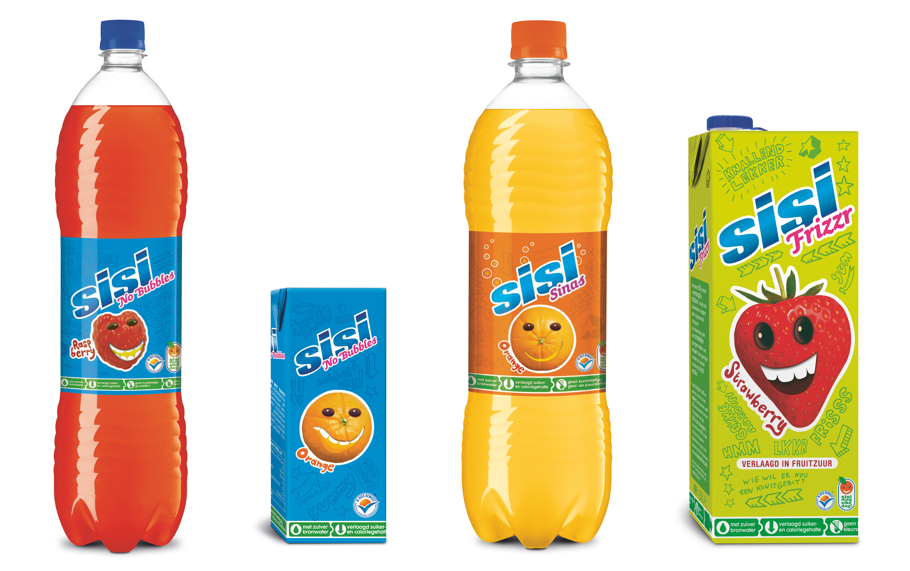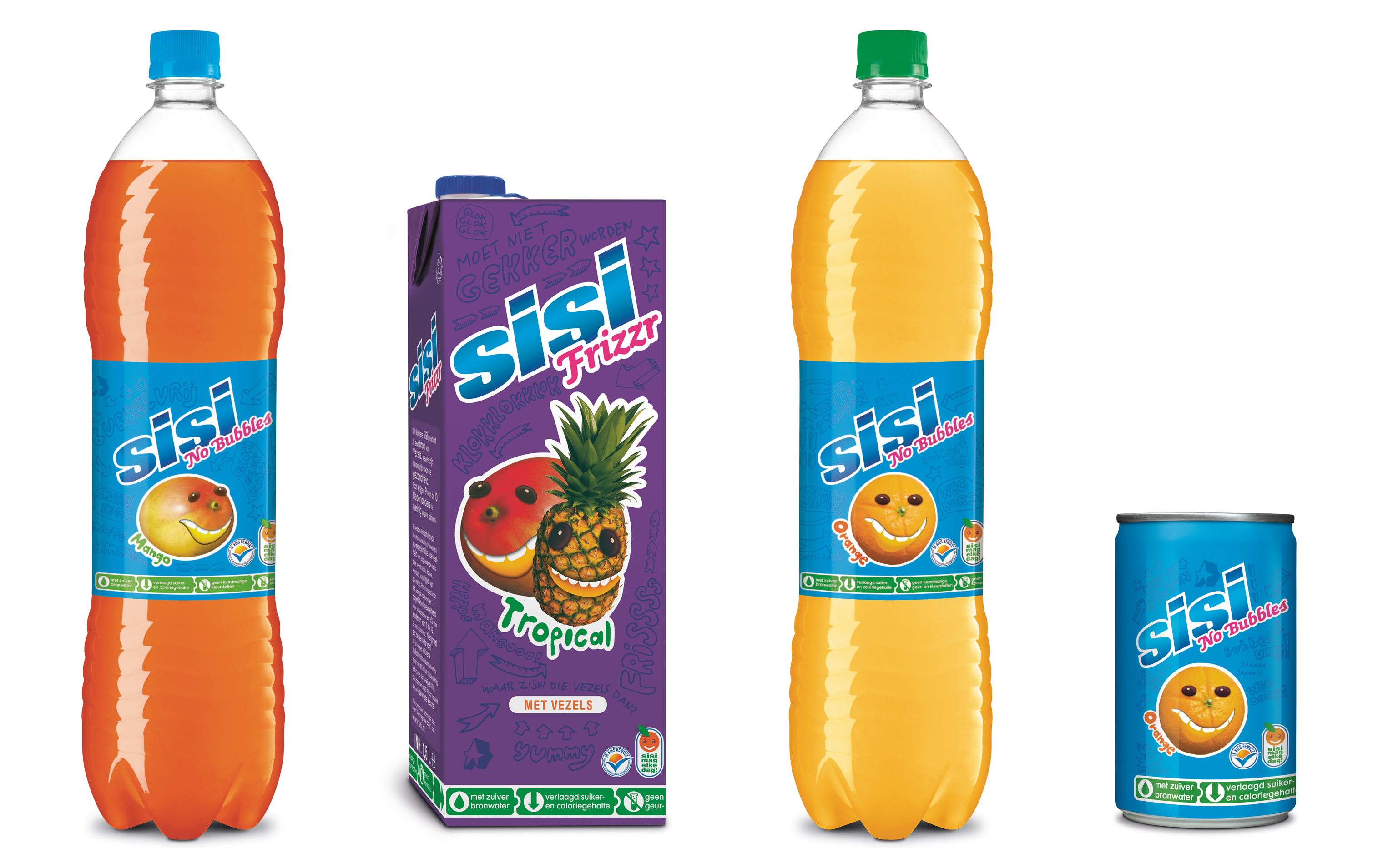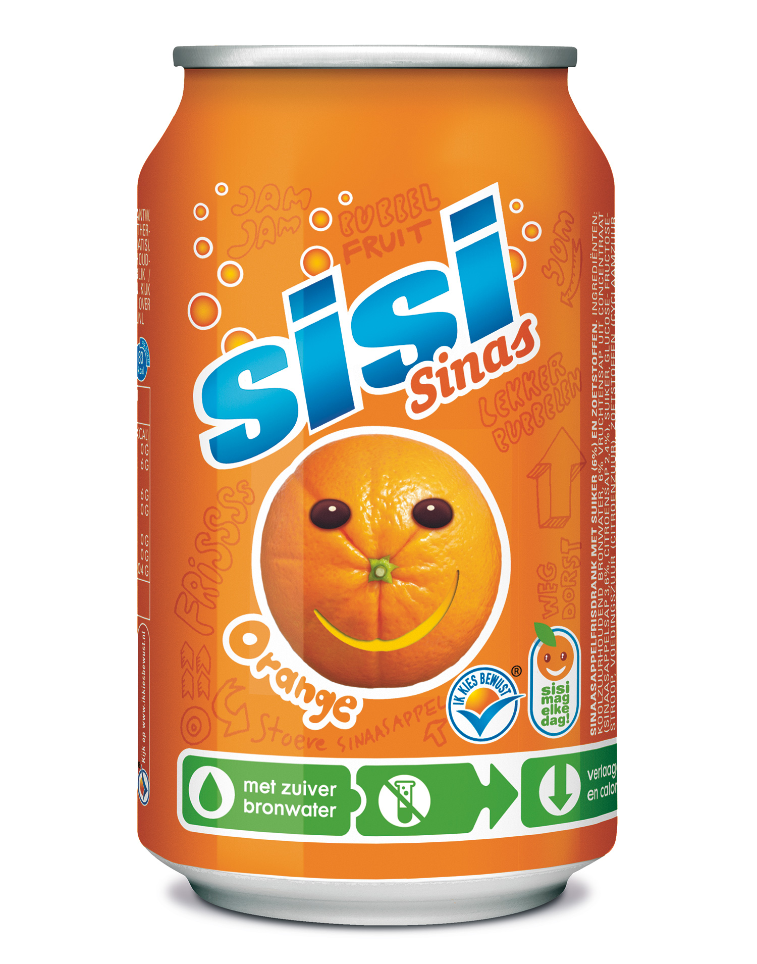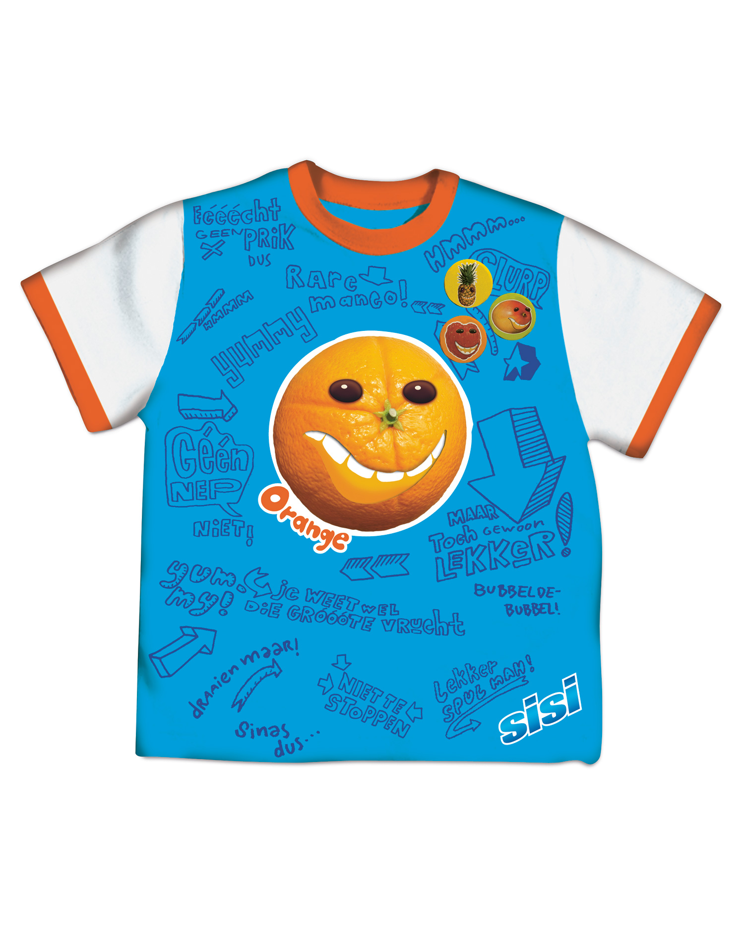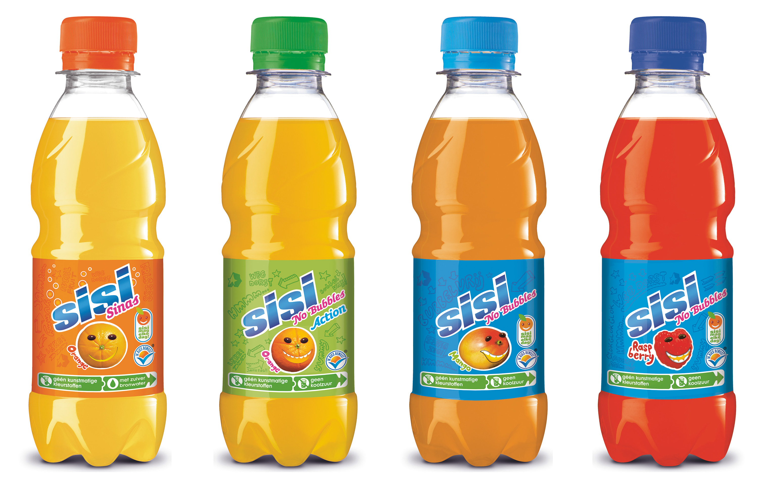
SiSi is a family of drinks that are aimed at a young audience. One of the distinguishing characteristics of this product is that it is a responsible choice health-wise. Therefore the packaging had to be simultaneously appealing to children and to parents. A kid’s choice but approved by mum!
The green information border is designed for parents, while the rest is fun for the kids. Intensive consumer tests proved that the design had the right balance.
The fruit characters Studio Kluif designed were later brought to life (for a dip in a jacuzzi) in a funny TV commercial by Doom & Dickson.
Nomination SAN accent in collaboration with Doom & Dickson and Combat 2007
