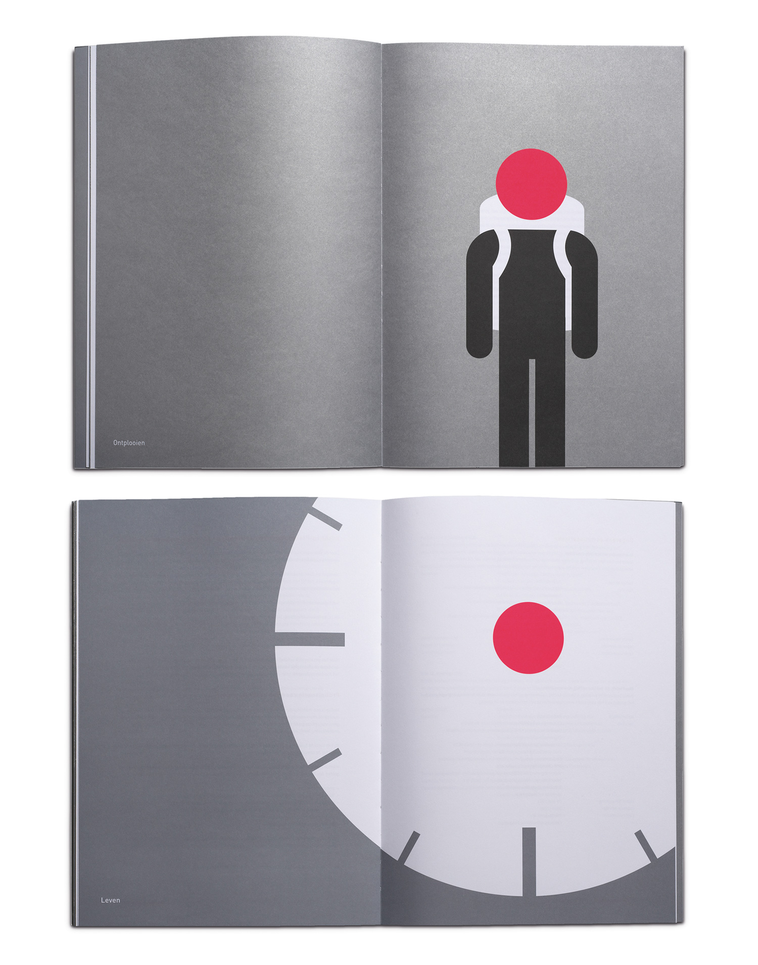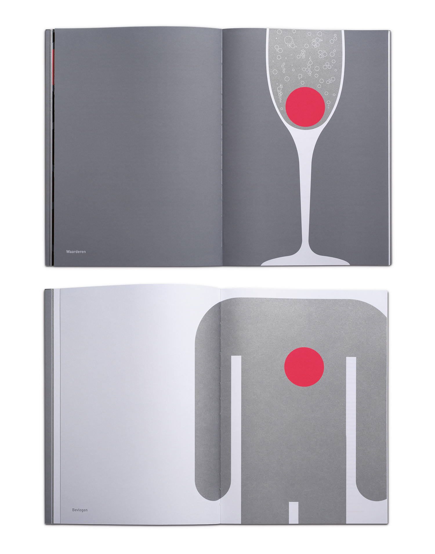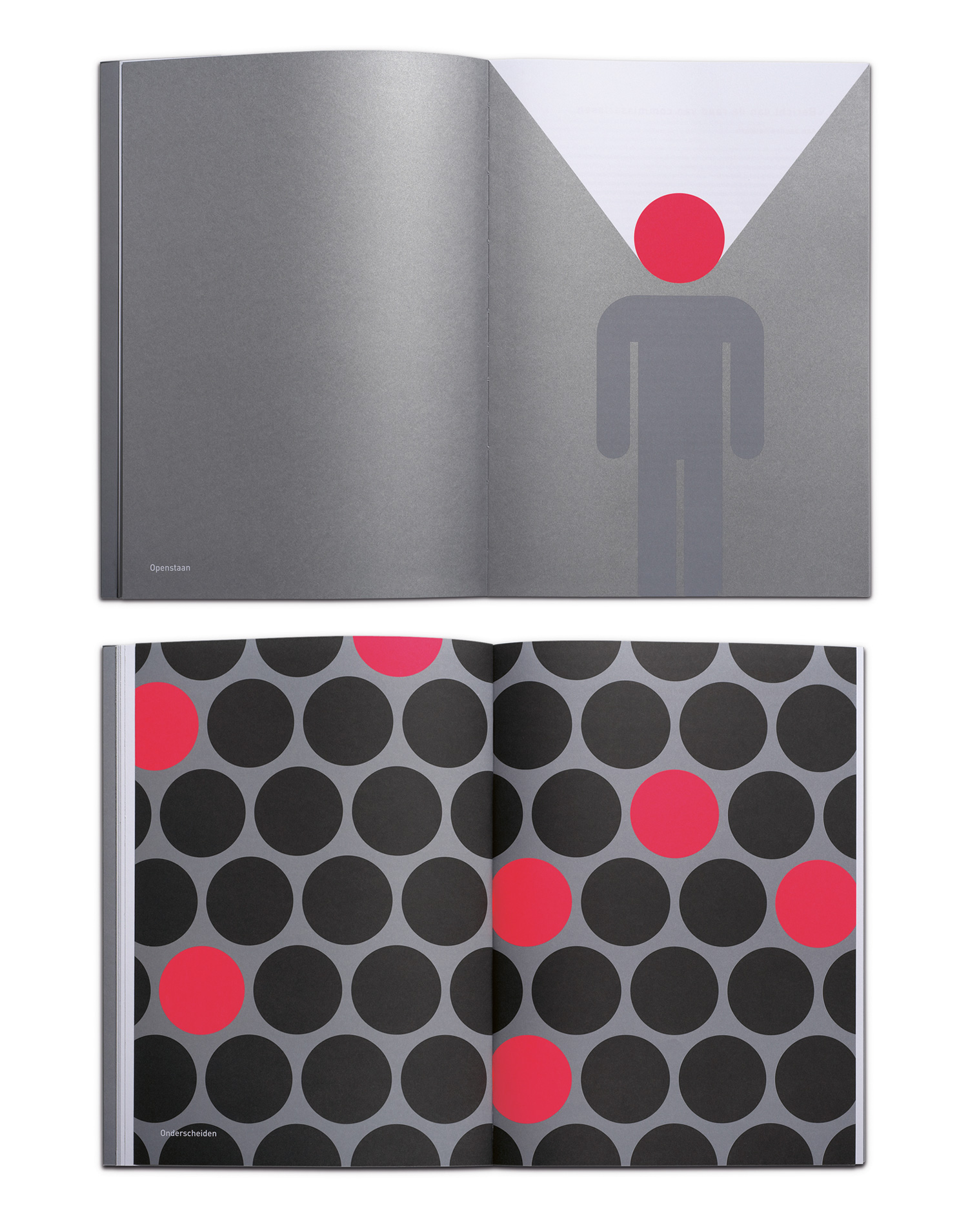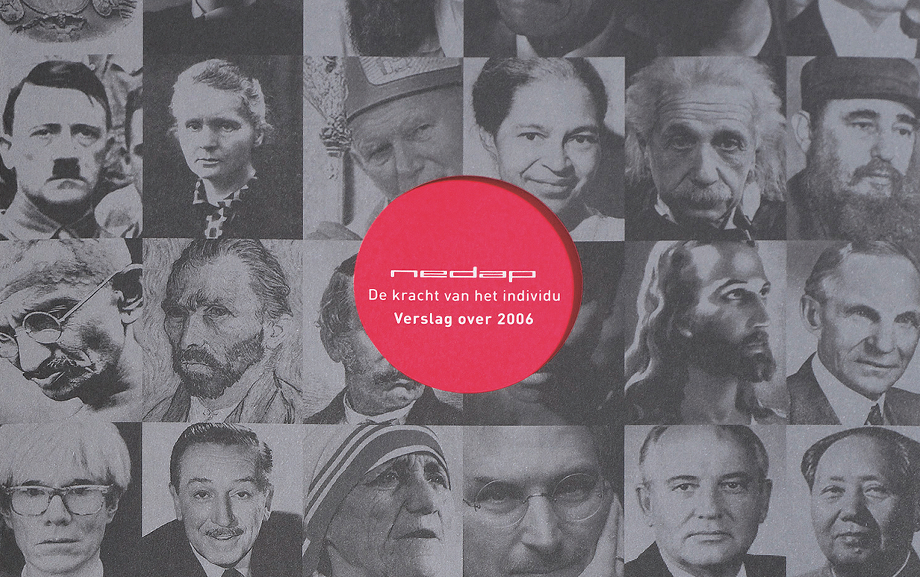
Throughout this soberly designed report, Kluif used a red circle to visualise the different topics that had to be explained.
The circle repeatedly occupies the same position on the page. Its context changes thus conferring it different meanings. The circle becomes the head of a person, the sun, the centre of a clock, a cherry in a glass, etc. Kluif only used three colours: red, silver and black.
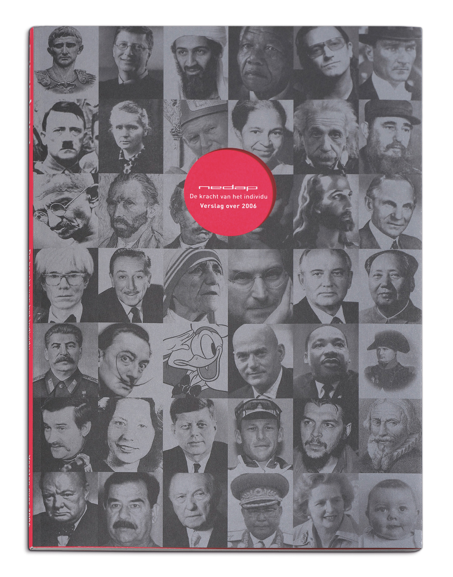
On the cover of this report we show portraits of powerful individuals. Positive and negative! A typical ‘less is more’ design.
