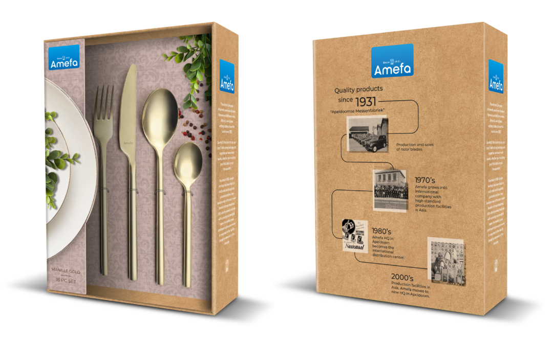
In 2012, Kluif designed the new corporate identity for Nedap. The basic icon for the new Nedap logo is an asterisk. This typographic symbol is commonly used as a call out for a further explanation of a certain topic.
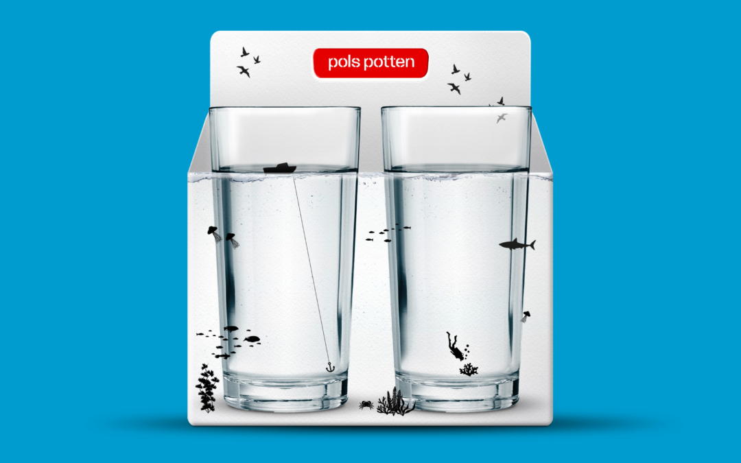
The technology that Nedap makes is technology that matters: sufficient food for a growing population, clean drinking water throughout the world and smart networks for sustainable energy are just a couple of examples of themes Nedap is working on. By using the asterisk Nedap tells the story behind these themes and the solutions they come up with.
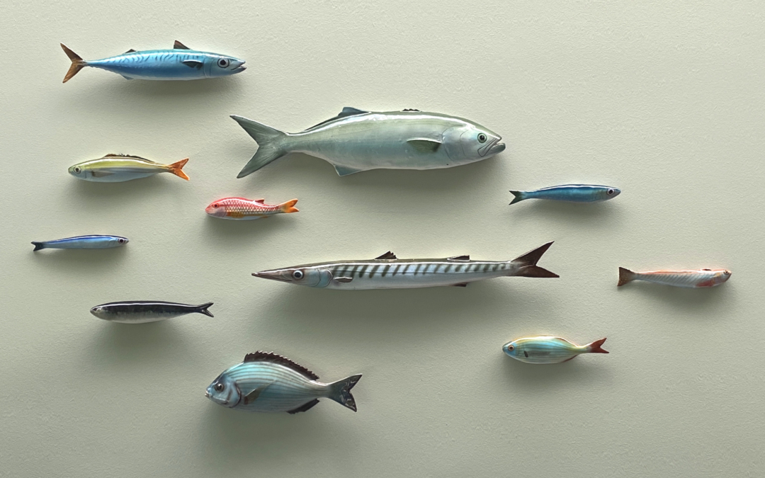
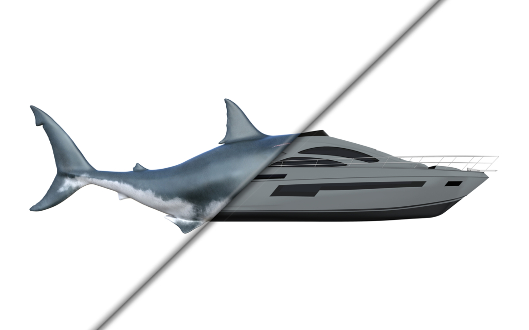
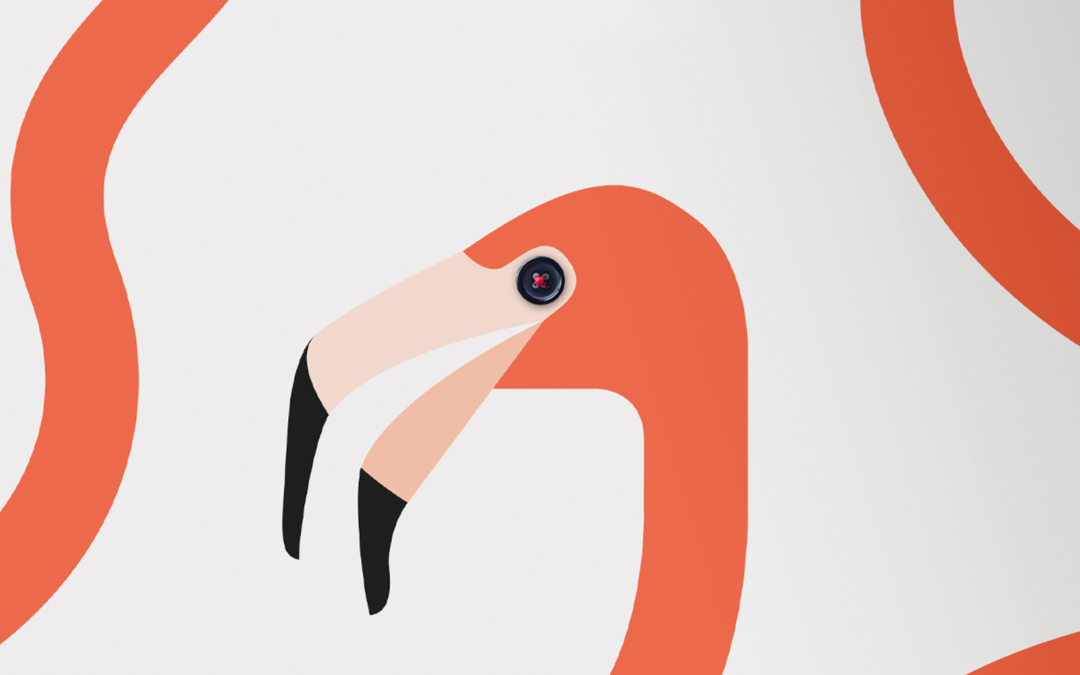
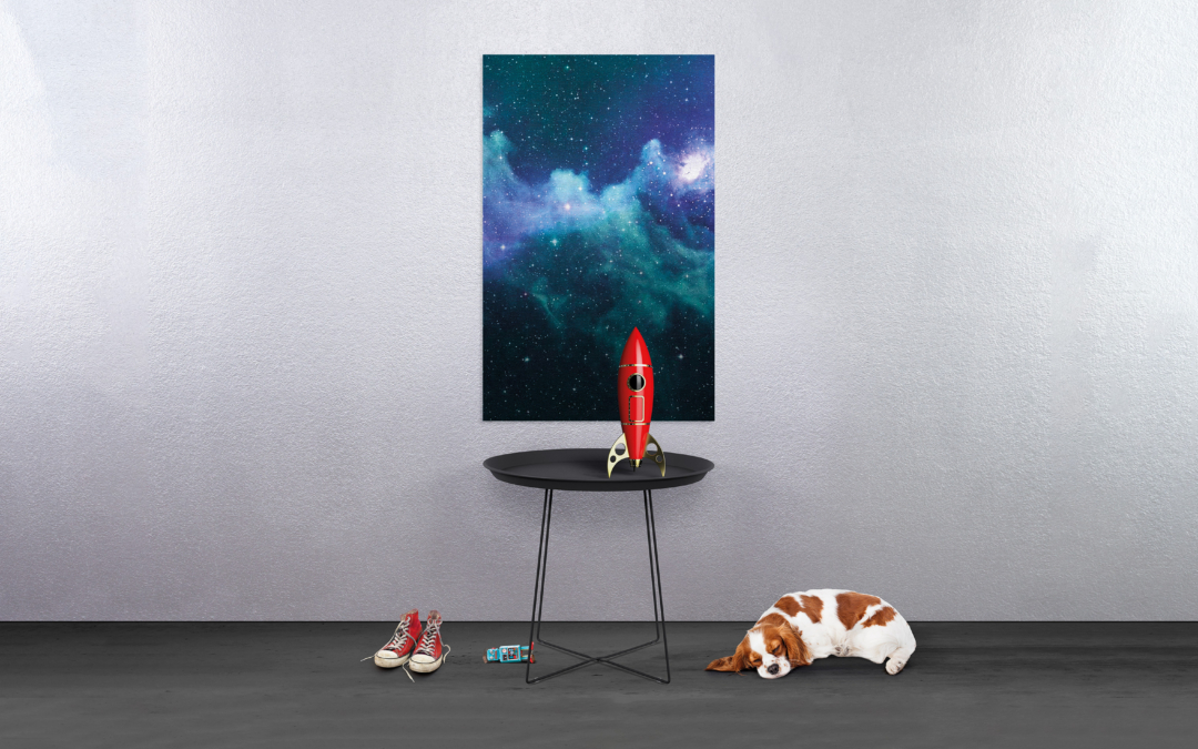
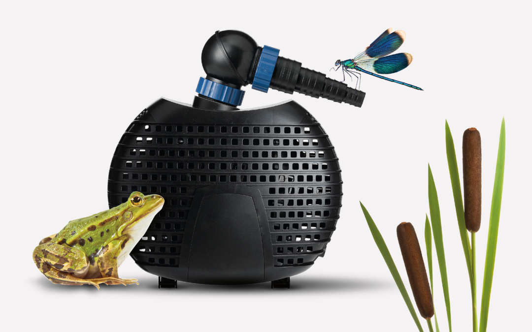
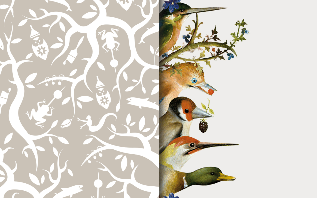
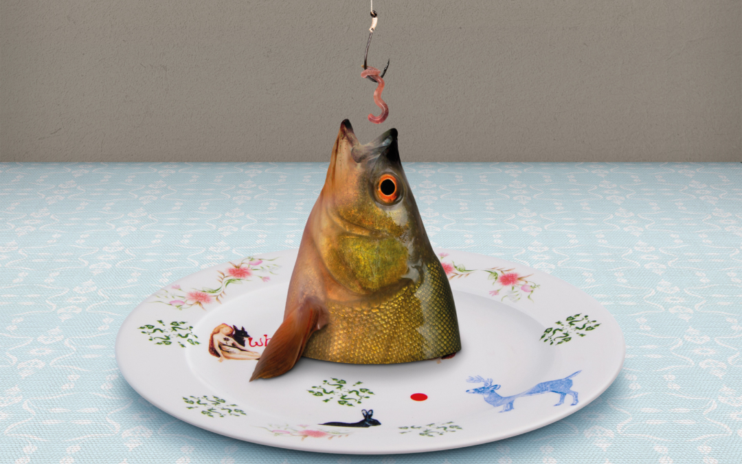
In the 2011 annual report, all of Nedap’s business units found their place on the walls of a virtual exhibition. This time the asterisk was not only the symbol of depth but also as the spark of inspiration and imagination. The art pieces always have a detail of the asterisk in them and symbolise the field in which each business unit operates. With the use of QR codes, the reader is able to get the in-depth story.
Nomination New York Festivals 2013